Introduction - Heat Media pack
1) Look at the Heat Media Pack. Go to page 2: the Heat mission. Write three things that Heat offers its readers under 'print'.
In print – we bring readers a truly unique, quality experience. From clever A-list access shoots no other magazine could pull off to celeb news – heat has the celeb contacts to give readers the exclusive every time
2) Now go to page 3 of the Media Pack - celebrity focus. What does the page say that Heat offers readers?
We ensure heat readers are always in the know and give them conversation- starters they can show off about to their mates down the pub. Our journalists have the answers to the questions before they’ve even been asked. We help celebrities to talk about their biggest secrets and we find the funny, wherever it’s hiding.
3) Now look at page 4 of the Heat Media Pack. What other content does Heat magazine offer its readers aside from celebrity news?
Fashion
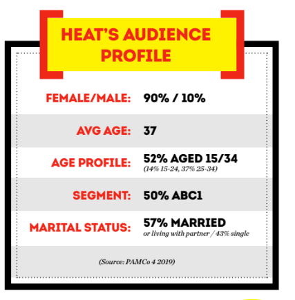
4) Look at page 5. What is Heat magazine's audience profile? Write all the key details of their audience here.
4) Look at page 5. What is Heat magazine's audience profile? Write all the key details of their audience here.
Media language
1) How are the cover lines written to make the audience want to buy the magazine?
utilizing attention-grabbing, attention-grabbing language to pique the reader's curiosity
2) What are the connotations of the Heat colour scheme on this particular front cover?
Heat magazine's front cover features a vibrant color palette of pink, purple, and red that screams energy, aggression, and excitement. These colors are usually associated with romance, love, and glamour, so it makes sense that lifestyle, relationships, and celebrity rumors will make up the majority of the magazine's content. Additionally, vibrant colors can create an image that is captivating and lively, implying that the magazine's content is captivating and attention-grabbing. When seen as a whole, the color scheme of the Heat magazine front cover conveys excitement, joy, and indulgence. 3) How are images used to create interest in the magazine? Find three reasons for your answer. (E.g. paparazzi images or aspects of mise-en-scene such props, costume, make-up, body position, facial expression etc.)
Paparazzi photos: By providing readers with a peek into the lives of celebrities, paparazzi photos are used in magazines to pique readers' interest. These unposed photos can give off an air of genuineness and offer an intimate glimpse into the glitzy world of Hollywood. 2) Mise-en-scene - To generate interest, carefully chosen mise-en-scene, such as accessories, clothing, makeup, posture, and facial expressions, is frequently used in magazine images. These components can aid in expressing a particular tone or subject, which will enhance the visual appeal and draw readers in. 3) Beautiful fashion and beauty photography that highlights the newest styles and trends can be found in a lot of magazines. By providing readers with fresh looks and styles and a means of escape, these pictures pique readers' interest.
4) What differences can you find between the use of design and typography between Tatler and Heat? List at least three differences and explain the effect on audiences.
1) Visual style: Tatler typically uses a more elegant and sophisticated visual style in its design and typography, with refined and classic typefaces and layouts. This conveys a sense of luxury and exclusivity to its audience, which is often made up of affluent and high-society individuals. In contrast, Heat tends to have a more playful and bold visual style, with a mix of fun and quirky typefaces and layouts. This reflects the magazine's focus on celebrity gossip and entertainment, appealing to a younger and more mainstream audience.
2) Hierarchy and organization: Tatler often employs a more structured and hierarchical approach to typography and design, with clear and formal organization of content. This aligns with its audience's expectation for a polished and sophisticated reading experience. On the other hand, Heat tends to have a more chaotic and dynamic layout, with a focus on eye-catching visuals and attention-grabbing headlines. This reflects the magazine's aim to capture the reader's attention quickly and maintain their interest through a lively and engaging format.
3) Use of color: Tatler tends to utilize a more restrained and refined color palette in its design and typography, often incorporating muted and understated tones to convey a sense of elegance and sophistication. This appeals to its audience's appreciation for classic and timeless aesthetics. In contrast, Heat embraces a vibrant and bold use of color, often incorporating bright and energetic hues to create a visually dynamic and attention-grabbing experience. This resonates with its audience's preference for a lively and upbeat visual style that reflects the magazine's focus on popular culture and entertainment.
Media Representations
1) What type of celebrities appear on the front cover of Heat? List them here.
Some examples of celebrities who have appeared on the front cover of Heat in the past include Kim Kardashian, Taylor Swift, Brad Pitt, Jennifer Aniston, and the cast of popular reality TV shows.
2) How are celebrities represented in Heat? (Positively? Negatively? Reinforcing or challenging stereotypes?)
In Heat, celebrities are frequently portrayed in both favorable and unfavorable light. They are usually presented in a positive light as powerful, glamorous, and successful individuals. Heat, however, also frequently feeds into the misconception that celebrities are shallow, materialistic, and fixated on their appearance. Occasionally, the magazine dispels these misconceptions by offering in-depth analyses of famous people that showcase their skills, volunteerism, or personal challenges. In general, it can be said that Heat's portrayal of celebrities combines challenging and reinforcing stereotypes. 3) How are women represented on the cover of Heat? Think about both images and cover lines here.
In Heat, celebrities are frequently portrayed in both favorable and unfavorable light. They are usually presented in a positive light as powerful, glamorous, and successful individuals. Heat, however, also frequently feeds into the misconception that celebrities are shallow, materialistic, and fixated on their appearance. Occasionally, the magazine dispels these misconceptions by offering in-depth analyses of famous people that showcase their skills, volunteerism, or personal challenges. In general, it can be said that Heat's portrayal of celebrities combines challenging and reinforcing stereotypes. 3) How are women represented on the cover of Heat? Think about both images and cover lines here.
Women are usually portrayed on the cover of Heat by pictures of public figures or celebrities. These photos frequently feature women dressed in glitzy or striking attire, and the cover lines frequently focus on the individuals' relationships, personal lives, or current scandals.
Cover lines frequently center on subjects like celebrity dramas, breakups, make-ups, or feuds, which can lead to a sensationalized portrayal of women. Furthermore, a focus on women's appearance and personal lives rather than their accomplishments or contributions may result from the use of provocative or attention-grabbing language in the cover lines.
4) How do Heat and Tatler represent social class? What different social classes can you find in the features and celebrities on the cover? (E.g. middle/upper class / working class)
Through the celebrities and physical attributes they select to highlight on their covers, Tatler and Heat serve as symbols of social class. Tatler showcases aristocrats, royalty, and upper-class socialites; Heat, on the other hand, usually caters to a younger, more mainstream audience through celebrities and reality TV stars.
Pop singers, actors, reality TV stars—celebrities from working-class or middle-class backgrounds—may be found in Heat. In the entertainment industry, these people have risen from relatively lowly starting points.
Tatler, on the other hand, showcases people from the elite class, such as wealthy socialites, titled aristocrats, and members of the royal family. These people frequently come from privileged backgrounds and have inherited their wealth and social standing.
Comments
Post a Comment